library(likert)# For the MathAnxiety data setlibrary(tidyverse)library(scales)library(viridis)library(ggrepel)library(willemverse)data(mass)# Prepare data by selecting some items and creating a long formatitems<-mass%>%as_tibble()%>%rename(gender =Gender)%>%pivot_longer( cols =-gender, names_to ="item", values_to ="response")%>%mutate( response_num =as.numeric(response), item =dplyr::recode(item, "ST24Q01"="only if I have to","ST24Q02"="favorite hobbies","ST24Q03"="talk about books","ST24Q04"="hard to finish","ST24Q05"="happy as present","ST24Q06"="waste of time","ST24Q07"="enjoy library","ST24Q08"="need information","ST24Q09"="cannot sit still","ST24Q10"="express opinions","ST24Q11"="exchange"), item =fct_reorder(item, response_num))colors<-brew_colors(5)theme_set(theme_minimal())
3.1 Single item plot
Responses to a single Likert item are best visualized with a (relatively) simple bar plot. Improvements to a standard bar plot can consist of plotting percentages on top of each bar and plotting the numeric Likert response options (e.g., 1 to 5) on the x-axis together with a legend that contains the response labels. This way you don’t run into issues with the labels being too long to place on the x-axis and you’re also explicit about how Likert responses are often treated as numeric values (rather than categorical values).
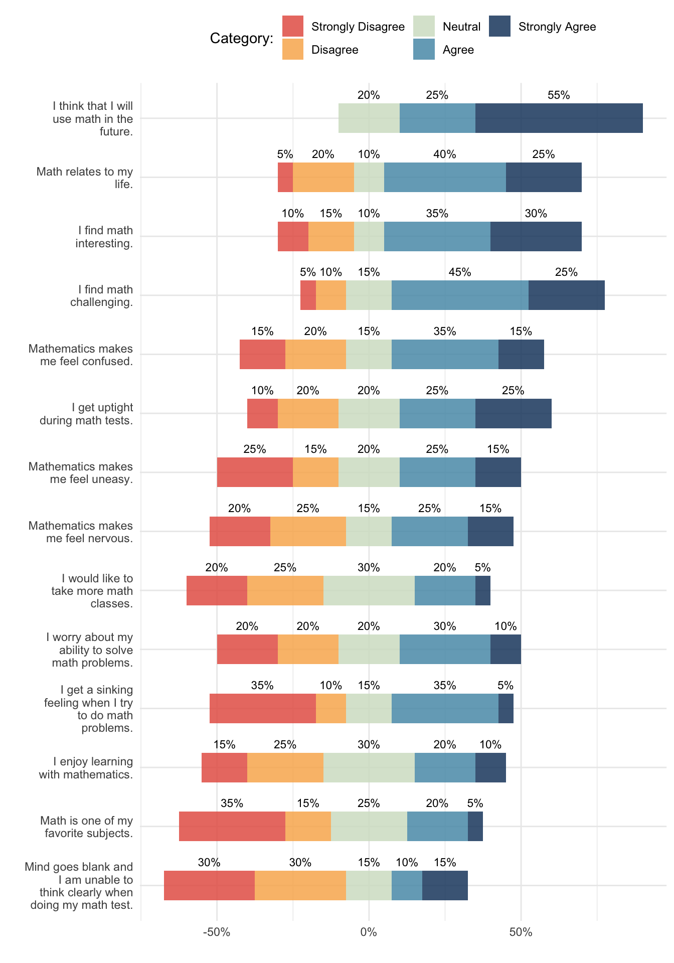
Plotting multiple Likert items is more difficult. If there are too many items, it becomes too messy to plot a bar plot for each item. Stacked bar charts are more efficient but they are difficult to interpret. To improve that interpretability, it helps to put labels on each segment of the stacked bar chart, flip the bars horizontally, and align the bars so it is easier to see where most responses lie. These are called diverging stacked bar plots. There are several packages that make this relatively straightforward to do, such as the likert and HH packages, although they don’t let you construct your own ggplot2 plot. Instead, you can use a geom from the willemverse to position a stacked bar geom in the same way.
---format: html: code-fold: true code-tools: true---# Likert plots```{r}#| label: setup#| message: falselibrary(likert) # For the MathAnxiety data setlibrary(tidyverse)library(scales)library(viridis)library(ggrepel)library(willemverse)data(mass)# Prepare data by selecting some items and creating a long formatitems <- mass %>%as_tibble() %>%rename(gender = Gender) %>%pivot_longer(cols =-gender,names_to ="item",values_to ="response" ) %>%mutate(response_num =as.numeric(response),item = dplyr::recode(item,"ST24Q01"="only if I have to","ST24Q02"="favorite hobbies","ST24Q03"="talk about books","ST24Q04"="hard to finish","ST24Q05"="happy as present","ST24Q06"="waste of time","ST24Q07"="enjoy library","ST24Q08"="need information","ST24Q09"="cannot sit still","ST24Q10"="express opinions","ST24Q11"="exchange" ),item =fct_reorder(item, response_num) )colors <-brew_colors(5)theme_set(theme_minimal())```## Single item plotResponses to a single Likert item are best visualized with a (relatively) simple bar plot. Improvements to a standard bar plot can consist of plotting percentages on top of each bar and plotting the numeric Likert response options (e.g., 1 to 5) on the x-axis together with a legend that contains the response labels. This way you don't run into issues with the labels being too long to place on the x-axis and you're also explicit about how Likert responses are often treated as numeric values (rather than categorical values).```{r}interesting <-filter(items, item =="I find math interesting.")interesting_props <- interesting %>%group_by(response) %>%summarize(response_num =first(response_num),n =n() ) %>%mutate(pct = n /sum(n))ggplot(interesting_props, aes(x = response, y = pct, fill = response)) +geom_col(alpha = .85) +scale_y_continuous(labels =percent_format(accuracy =1)) +geom_text(mapping =aes(label =paste0(round(pct *100), "%")),vjust =-0.5,size =3 ) +labs(x ='"I find math interesting."',y ="Percentage of respondents",fill ="Categories" ) +scale_fill_manual(values = colors) +guides(fill ="none") +theme(legend.position ="bottom")```## Multiple items plotsPlotting multiple Likert items is more difficult. If there are too many items, it becomes too messy to plot a bar plot for each item. Stacked bar charts are more efficient but they are difficult to interpret. To improve that interpretability, it helps to put labels on each segment of the stacked bar chart, flip the bars horizontally, and align the bars so it is easier to see where most responses lie. These are called diverging stacked bar plots. There are several packages that make this relatively straightforward to do, such as the [`likert`](https://github.com/jbryer/likert "likert R package") and [`HH`](https://cran.r-project.org/web/packages/HH/index.html "HH R package") packages, although they don't let you construct your own `ggplot2` plot. Instead, you can use a position function from the `willemverse` to position a stacked bar geom in the same way.```{r}#| message: false#| fig-height: 10#| fig-align: centeritem_props <- items %>%filter(!is.na(response)) %>%count(item, response, response_num) %>%group_by(item) %>%mutate(pct = n /sum(n)) %>%ungroup()ggplot(item_props, aes(y = item, x = pct, fill = response)) +geom_col(position ="likert", alpha = .85) +geom_text(aes(label =paste0(round(pct *100), "%")),position =position_likert(),size =3, ) +scale_x_continuous(labels =percent_format(accuracy =1)) +scale_y_discrete(labels =wrap_format(20)) +scale_fill_manual(values = colors) +labs(x ="", y ="", fill ="Category:") +guides(fill =guide_legend(nrow =2), color ="none") +theme(legend.position ="bottom")```